


Capitalising Colour
How Punctuation Combats Racism in Language

Violent attacks against mosques, looted shops, cars in flames, a library smashed to pieces, online death-threats and incitings to murder, brazen show-downs with seemingly helpless police, and a population in fear of going about their daily life if they happen to wear Islamic clothing, have darker skin, or are working for immigration services: England has recently seen its worst far-right riots in over a decade, sparked by a false but viral allegation on social media that the suspect arrested in relation to the horrible stabbing of three little girls in Southport on 29 July was a Muslim and/or an asylum seeker. Some more peaceful protestors took to the streets with signs in order to express their frustration over a perceived loss of “their” country to the nefarious influence of foreigners (I’m trying to be sober about this here…). Other gatherings quickly turned into violent mobs of barefaced racist, unhinged hooligans, rampaging across cities like Manchester or Hartlepool.
This had me thinking about another painful convulsion of a society deeply divided over and by race and justice: the killing of African-American George Floyd in summer 2020, followed by Black Lives Matter protests across the U.S., and counter-protests by white supremacist groups. In the wake of this distressing moment of reckoning about just how fair and equal America actually is, media outlets started to capitalise the b in black, as in Black history, or Black music, or Black-owned businesses.

This seems like a fairly easy change, conveying respect and recognition through typographical punctuation (meaning we’re not talking about a sign itself, but doing something to how letters look like). But it’s not that easy. Anything but, actually.
So, what are the promises and pitfalls of capitalising b/Black? How come we attach value to a shift from small to big? Is an explanation to be found in the history of capitalisation, and what is its history in the first place? Let’s trace the big C back into the distant (very distant!) past, then return right up to our current conventions, providing the backdrop for the pros and cons of capitalising race/ethnicity/skin colour/social identification/anything. Spoiler alert: I don’t have a clear opinion about this, as so often, yet find it fascinating how text and punctuation become bones of contention for hugely complex social issues. Let’s keep our mind malleable!
You think you know: what is capitalisation, actually
First things first: capitalisation is a part of punctuation. Hear me out. There is our repertoire of signs both narrow and broad. Narrow, that’s marks like , or - or ? which show up grammatical relationships between words, and orchestrate tone of voice. Then there are signs of a broader punctuation category like # and * or footnotes which don’t tell us anything about syntax or emotion, but which do something to the text, and thus to our eyes and minds: asterisks and footnotes refer us to a text outside of the main text, making our eyes rove, hands flip through the book, minds contemplate added information and its relationship to the main text we’re reading. And then there is typographical punctuation.
That’s any manipulation of the looks of text such as bold type, italics, ALL CAPS (or capitalisation in and of itself), different typefaces like Times New Roman or Calibri, the spaces between letters, their general form whether round or angular, the relationship between text and picture, and formatting, so whether margins are justified, if the text is single-spaced, any indentation (when the first line reaches into the left-hand margin, or the other way around when it starts a few spaces into the block of text), and paragraphing of course — basically, the handling of blank space on the page. All of this is also punctuation, because at the heart of its definition lies the action of doing something to written words in order to give them meaning beyond meaning, beyond content, through arrangement and aesthetics.
This was a long pre-amble to say that, yes, capitalisation is part of punctuation, because it changes how text looks like, and thus creates difference between words. Modern English capitalises the first letter of the word starting a new sentence. technically, we don’t need that, because we have final punctuation like ? or ! or . to tell us where the sentence is done. Texting makes both initial capitalisation and final punctuation redundant, because the speech bubble clarifies that from here to here is one utterance, but that’s another story. In traditional encounters with text, it’s useful to give the eye extra-help, and let it know the start of the next bit of text through initial capitalisation, particularly if we have to rely on such a tiny speck of dust like a full stop that easily drops in and out of the line. And anyway, initial capitalisation is older than the full stop as we’ll see shortly, so let’s hang onto what worked for our ancestors a little longer.
A couple of other preliminaries: not all written languages have capital letters. The different East-Asian and South-Asian scripts do not have either capital letters or any equivalent in their systems. Arabic and Persian do have different versions of each letter, depending on whether it’s at the beginning, middle, or end of the word where one uses the “big” form of the letter. Additionally, some letters need to be connected, some not, so perhaps one could call that a kind of upper and lower-case system, but perhaps not. Let me know what you think in the comments!

And lastly…what is capitalisation actually?
This, too, seems straightforward, but it’s not.
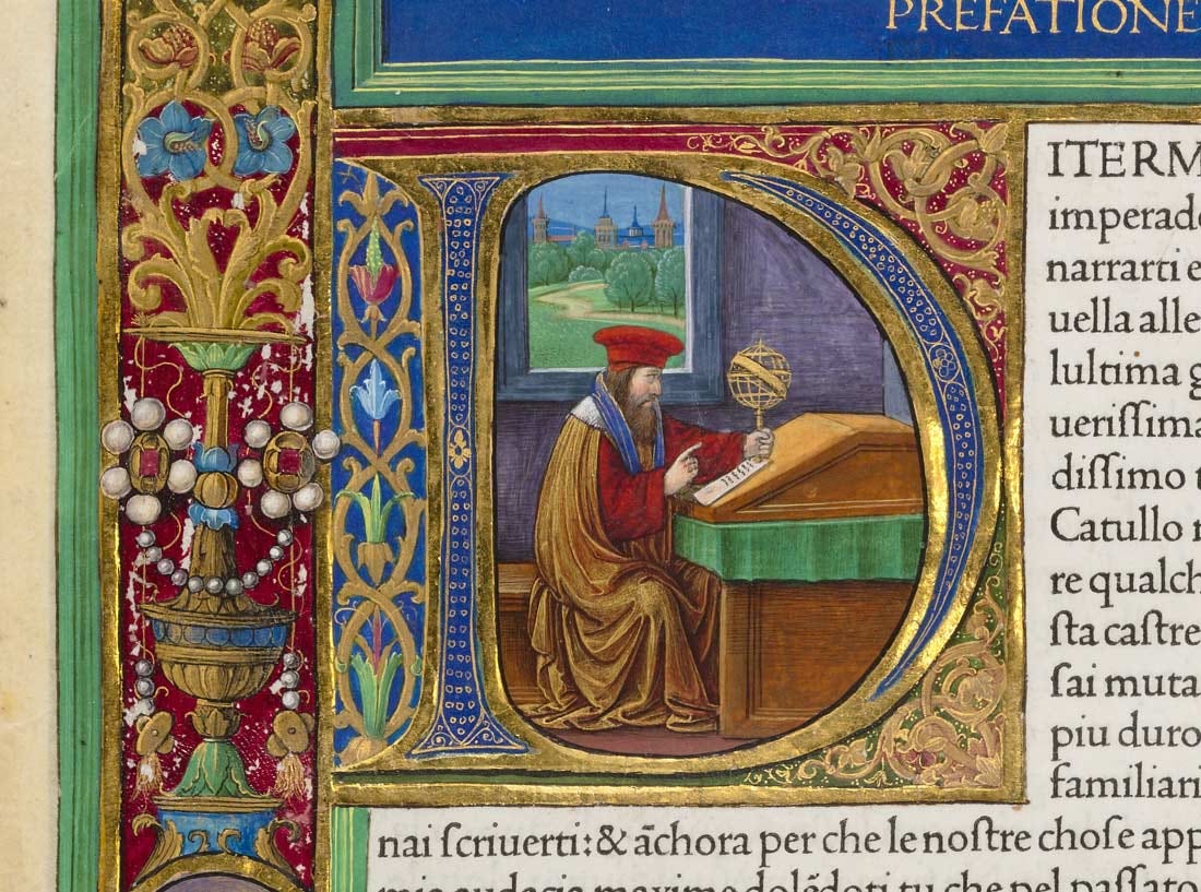
There are different ways of making initial letters bigger, for example a drop capital. That’s an outsized first letter of the first word of each chapter, set within the block of text, and several lines big.
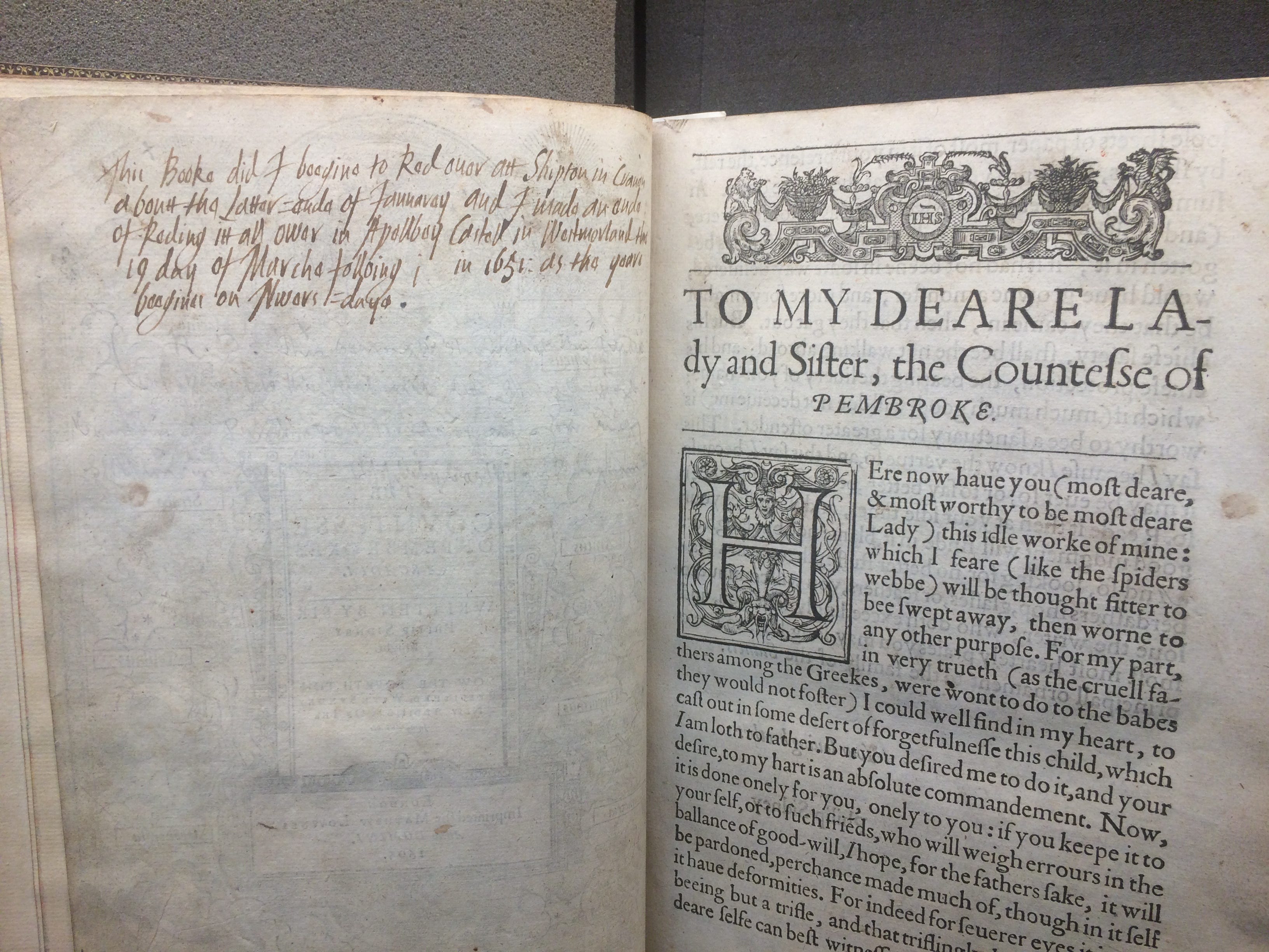
A drop cap can be just a letter itself, or decorated with animals, humans, foliage, or geometrical designs. When the illustration is random, it’s called an inhabited initial; if the decoration makes sense as a mini-story, it’s called a historiated initial. Both are common in medieval and Renaissance books.
Apart from initial caps, there are also ALL CAPS, but that’s not what we’re after. Capitalisation is using the big version of the same letter for the first letter of a word. Capitalisation is only that, I would suggest, if there are also small versions of the letters. So, I wouldn’t call the following capitalisation, because the first letter is simply enlarged, but they’re all caps.

For capitalisation to be really that, we need to have two manifestations of the same letter or sound: one big (also known as majuscule also known as upper-case), and one small (minuscule, or lower-case). We’ll come back to those names, and also trace the long and winding road towards those typographical twins of one parent. Here comes the story of capitalisation in Western Europe.
Long, long time ago: the origins of capitalisation
INTHEBEGINNINGLATINGANDGREEKWEREWRITTENLIKESOWITHOUTSPACESORMARKSBETWEENWORDSANDWITHASINGLESHAPEOFTHEALPHABET. Difficult to read? Yeppers, that’s what it was for inexperienced readers back over 2000 years ago, too. We can’t go into the reasons for this near-total lack of punctuation, so if you want to know more about this, check out my article here. What’s important to realise now is that there was no such thing as a mark of punctuation in the narrow definition: not even a full stop or comma to tell you where to breathe, or where a sentence was over.
Instead, scribes who copied manuscripts or noting down the dictation of their masters, and teachers who made reading easier for their students would add personalised signs to mark breath, or to section off parts of the frequently long and complicated sentences. Those were not standardised widely-current signs everyone agreed-upon, so while they tell us writers and readers at the time had a notion of doing something to the text to make it more readable or to say something about its structure, we’re interested not interested in private practises, but in a sea-change in terms of widely-held concepts of punctuation.
A kind of proto-capitalisation was, in fact, one of the earliest ways of dividing text, before a system of dots to separate parts of the sentence like comma and full stop entered Latin via Greek. At least by the first century B.C., scribes enlarged several letters of the first word of a section of text which later book historians would call littera notabiliores (“noteworthy letters”). Remember, again, that there was as yet only one look of the letter which we now call uppercase, but back then was just that: the only shape of that particular letter.
In addition to larger initial letters of a division, scribes sometimes also off-set those letters outside of the column of text. Such protrusion to the left could indicate the start of a new sentence or of a new section, and it makes sense why they later acquired the name caput, or “head”, or the diminutive capitulum, “little head”, since the line stuck out of the body of text like a head, or like the top of architectural columns – also called caput, or “capital” in English (hence the term capital letter today).

Classics scholar Shane Butler believes this practise of outdenting larger letters developed around the same time as littera notabiliores, and became habitual by late-antiquity (around the fifth century A.D.). Occasionally, we find the letter K for capitulum in the margin next to a section that’s not otherwise marked.
How we came from capitulum as enlarged and outdented initial letter of a section to chapter is a different story for a different newsletter, but it’s all got something to do with words straying into the margins, and the metaphor of the body for text on the page. Alright, we’re slowly moving towards “real” capital letters at the beginning of sentences…
We’re in the early Middle Ages (from around the 7th to the 9th century A.D.), and a lot of momentous developments are happening in writing, y’all! Up in Ireland, a collective of monks is trying to learn Latin by copying the Bible and squeezing the Irish translation between the lines above each word. At the time, text still didn’t have spaces between words, which makes this activity called parsing hard and cumbersome. In a stroke of true genius, the monks introduced blank spaces between words, making their learning and our reading easier and faster within an instant. The repercussions of this simple and straightforward airing of text design are truly unimaginable, think of widening access to inexperienced readers, fewer mistakes and faster deciphering, increasing scholarship, diplomacy, trade – you literally cannot over-estimate the impact of nothingness on the page!
This amazing invention of spaces between words travels down south, and reaches the Continent. Here, at the court of Emperor Charlemagne in the strategically-picked city of Aachen between Germany and France, a powerful centre of learning and innovative text design was in full-swing by the late 8th century, funded by a monarch who understood that administrating his vast lands required sophisticated documentation. He gathered together the best scholars of Europe like the English bishop Alcuin, and the savviest scribes with the most cutting-edge knowledge of scripts, giving rise to what we now call the Carolingian Renaissance. This busy flourishing of intellectual activity eventually brought forth a legible, elegant, quickly-produced, uniform script with differently-sized versions of the same letter, which we now call uppercase and lowercase: Carolingian minuscules, looking very Lord of the Rings.
TEXT TITLES came in capital letters, Subtitles in mixtures, and lowercase for the main texts, creating a smart, standardised, and clean look for the page through typography. It is also around this time that scribes start to capitalise the first letters – of sentences. That, combined with the development of small and big shapes of the same letter, and we’ve got our capitals the way we use them today. Ta daa!
I just want to pause here for a tiny moment, and acknowledge just how long it took to get from TEXTWRITTENLIKETHIS to writing the way we are used to it now. Just how many brains have contributed to improving both the material on which to write as well as the design of the same, how many decisions were necessary, implementations, explorations, and also sheer luck to make this stick as opposed to that. In my work, I often find myself challenged to step out of what’s so habitual – blank spaces between words, for instance – and try to experience with the eyes and minds of the past. Everything we take for granted today had to be invented at some point by someone for a particular reason, and that something had to be picked up by the next person and the next and the next until it becomes convention. I find that a humbling realisation, because even such a seemingly insignificant circumstance like a small and a large version of a letter is a testament to human history, and I feel connected across thousands of years and many miles to a Roman scribe, an Irish monk, or a Frankish lawyer, scratching out words on papyrus or parchment.
The rest of the story of capitalisation is short: medieval manuscript culture doesn’t know standardisation or rules of spelling as such; it’s more like scribes following the text they’re copying from, and changing according to practical circumstance and personal taste. During the Renaissance, text gathered increased uniformity in terms of how readers expected it to look like, including margins, formatting, general legibility, different typefaces for different kinds of texts, and illustrations, fuelled by increased access to formal education and the introduction of the printing press, churning out large number of relatively identical copies of the same volume.
And it’s of course owing to the printing press that we’ve got the terms uppercase and lowercase: typesetters worked in front of an arrangement of little wooden boxes, containing the letters of the alphabet, punctuation, blank spaces, and any other signs necessary to prepare a text for printing. The uppercase versions of the letters lay in, you guessed it, the upper cases, and the lowercase shapes in the cases below those.

While some language-fans like John Hart tried their very best to push for greater standardisation in spelling in particular, the reality on the ground was conditioned by mostly haphazard choices and habits: Renaissance printers (and writers) would often capitalise titles, Latin names, nouns (for example Juliet’s ‘oh, Moon!’), things they thought were important or interesting or somehow noteworthy. Perhaps a little like those ancient littera notabiliores? That said, there was no value attached to capitalising.
Although handwritten texts show writers doing whatever the hell they wanted well into the late nineteenth-century and beyond from Thomas Jefferson to Emily Dickinson, it’s around 1800 that the tide turns against random capitalisation. During the eighteenth century, there had been a veritable explosion of grammar book, dictionaries, and style guides, attempting to prescribe language and writing, both in Europe and America. Some of the reasons are social (good expression allows for potential upward mobility), some scientific (linguists tried to systematise language parallel to other disciplines like biology or chemistry). These often self-declared grammar gurus didn’t like the perceived excess of capitals merrily populating the pages, and demanded a reduction of large letters, so that capitalising would mean distinguishing a word from its surroundings. The present-day system emerges, holding caps back for rare and specified occasions such as the beginning of sentences, proper names (people, places, institutions), and the great honour conferred to a consciously capitalised word. Capitalising a word that doesn’t require it such as an adjective now means something. Enter the year 2020.
In the lowercase no more: capitalising Black
And what an annus horribilis 2020 was. The pandemic. George Floyd’s murder by the police. Violent clashes over race in the US. Trump’s potential re-election. Feels like we couldn’t catch a breath since, and are staggering from one global catastrophe to the next. Back in late-spring of 2020, American media attempted to address the socio-political upheaval the country experienced in its spelling, and what that spelling choice would say about each outlet. In June, the hugely influential Associate Press opted for a capitalised Black ‘when referring to people in a racial, ethnic or cultural context’ (as opposed to white owing to the lack of shared history). CNN and FOX NEWS followed suit, while CBS News also capitalises white (in the interests of consistency?) unless it refers to white supremacists in order not to imitate and legitimise white suprematists’ self-glorification.
The National Association of Black Journalists have pronounced white should be capitalised, too, as should brown. USA TODAY believes ‘Black is an ethnoracial identifier that is inclusive of the collective experiences of the Black U.S. population, including recent immigrants’.
The New York Times weighed in, picking the uppercased Black because this typography ‘conveys elements of shared history and identity’ of ‘people and culture of African origin’. Hence, it also writes Native, Latino, and Asian-American with initial caps, but lowercases brown and white, because those are too unspecific, and people (supposedly) don’t identify themselves through them, or when they do, it’s unsavoury (in the case of white, that is).
On the other hand, the NYT admits, the question over white or White is a hairy one, because while nobody wants to do like the racists who aggrandise themselves with the capital letter, writing White but talking about racial justice could reclaim the typography, rendering its provocative potential obsolete. Additionally, lower-casing white but uppercasing other races/ethnicities/colours (see below!) could convey that white remains the default, invisibly propping up existent power structures, because the w of white privileges vanishes into the surrounding lowercase without being called out for what it is.
So, that’s the lay of the land right now in American media: recognition, lip-service, confusion, contradictions – and I love it. Because we’re talking about things, we’re discussing, weighing up, defending, refuting, and all through the medium of punctuation.
I must say I have mixed feelings about this, because I am allergic to prescriptions in writing (and the attendant casting of moral judgment over the person who does not comply with spelling impositions), and because the capitalising of the b doesn’t strike me as particularly thought-through; more like a kind of knee-jerk reaction to a painful social upheaval and unforgivable crime; a bread-and-games kind of situation: give them the capital letter and they’ll shut up about systemic racism. Punctuation can become a cop-out for truly addressing the problem. A capital B big enough to hide icky anxieties and dismissive lack of will to dismantle the realities beyond the screen.
Then again, I get it. Language is a powerful driver of perception, and so is its written manifestation. Capitalising Black can go a long way making African-American presence and contribution to US history visible and respected. My worry is just that we stop here, at the passive hope is that change somehow trickles out of text into true life. I doubt it. The pen is powerful, but as we now see with the genocide in Gaza, the AI-fuelled sword is much more powerful than any ICJ-issued order.
And yet, we will of course capitalise Black. We will still do it, and we will still hope, because that’s all we ordinary people have, really. And while we wished change was faster, it is often slow, slow. So, we need to start somewhere. That is what W.E.B. Du Bois thought, sociologist, academic, and activist, and the first Black American to earn a PhD from Harvard University. In the 1920s, Du Bois campaigned for capitalising the n in Negro in newspapers, because ‘Eight million Americans are entitled to a capital letter.’ After years of tireless lobbying, papers started to adopt Dr Du Bois’s suggestion. On 7 March 1930, the New York Times writes: ‘In our ‘style book’ ‘Negro’ is now added to the list of words to be capitalized. It is not merely a typographical change; it is an act of recognition of racial self-respect for those who have been for generations in ‘the lower case.’
Upper- and lower-case have become concomitant with a stratified cast-system of higher and lower-value humans, based on a mixture of skin-colour, ancestry, and participation in a collective identity.

It’s an incredible achievement of brave and persistent activists to get from “coloured” to “negro” to “Negro” to “black” to “Black” in the long hard and ongoing struggle of equality. Yet, I find capitalising any of those initial letter not entirely straightforward for two reasons: capitalisation does not automatically equate elevation. Yes, it may mean the author thinks this word and its referent is somehow important or noteworthy, but it’s a misinterpretation of the punctuation function to assume an initial capital letter confers any kind of status or honour. Capitalisation (just like bold or italics or underline) is a way of singling text out for a reason that’s often context-specific, although it certainly has a range of expected effects such as emphasis, special attention, and dignifying. But, as the UN online editorial manual for conference management states: capitalisation is not a mark of respect, and not capitalising does not show a lack thereof.
And then there is race.
Most media that opted for capital b in Black argue their choice is not about skin tone, but social identity. There are shared histories and practises, producing a kind of culture, a collective identity warranting capitalisation as testament to that intangible dispersed shared possession. If that is the case – and I believe it’s largely valid in the context of African-Americans – I’m unsure how far newly-migrated black people also tap into this culture. A ten-generations-New-Yorker seems to have a profoundly different upbringing to a recently-arrived Jamaican or Nigerian. So capitalising Black then seems to refer to African-Americans who have grown up in the US, and whose roots may or may not lie in the trauma of forced abduction and enslavement.
So, I think there are a lot of confusing assumptions here, both excluding and including skin tone, and excluding and including culture. Not to speak of self-identification, because an Obama seems to have more in common with a Biden in terms of lifestyle, education, speech, and wealth than with a black single-mom, working two jobs in rural Texas. One can be black and have a white lifestyle, and white and have a black lifestyle. It seems that capitalising the b subscribes to notions of race that strike one as question-able, in the sense of subject to enquiry. Instead, we bypass looking behind the veils of categories that white Western culture came up with for racist divisive purposes when it started to colonise vast stretches of the “global South”.
As a mixed-race person myself, I’m perplexed and piqued (and not in a good way) that “brown” should not be a collective identity with shared experiences: an Atlantic journalist believes brown is ‘neither a culture nor a salient social category’, because it refers to a swathe of origins from Arab to Latino to South-East Asian. Basically, any non-Caucasian with tanned skin. I imagine I share experiences concerning identity , for example, with another mixed-race person, brown-skin, or passing-white, or however they look like. All this is to say: who we are, how we’re seen, where we locate our belonging at any point in time is infinitely more complicated than can be encompassed by typography, and slapping a capitalised letter onto the screen is a pat answer for a hinterland of complexity, highly individual and subjective, whose dunes keep shifting throughout a person’s lifetime.
Who gets to decide spelling anyway? Remember the constant chorus of this newsletter: there is nothing inherent in text that needs to be the way it is right now. There are biological reasons for how we humans have developed writing over thousands of years (eye-movement for example is a relative constant across time and space, because it anchors in the human body, not so much in scripts). There are practical reasons for writing surfaces, formatting, text production. But there’s nothing, and I repeat, absolutely nothing that dictates spelling, typography, or even punctuation. There, I said it!
So, who gets to decide capitalisation? An individual? An institution? An organisation? Is it empowering if I as a brown person am not allowed to capitalise Brown if I so want to? Because mixed-race people traditionally fall through the cracks, and brown, to me, hits that mixture that I am (although, again, I don’t fully subscribe to notions of race in the first place). Yet, the Centre for the Study of Social Policy says ‘[e]stablishing a rule, instead of leaving capitalization to the writer as a choice, emphasizes the critical importance and political permanence of these words as real, existing racial identities.’ So much for respecting the wishes of those involved. Unless someone else knows my needs better than me?
I wonder whether the capitalisation of Black is a particularly American issue: while it has been a century-old concern, it’s only received focussed attention during the BLM momentum in 2020. In Britain, for example, the BBC does not capitalise black, although it does use the UK-specific term BAME (black, Asian, and minority ethnic): a bit of a catch-all term for black Africans, black Caribbeans, South-East Asians, East-Asians, Arabs, any kind of “Gypsie” or traveller (I’m quoting the BBC), and of course any British person with this ancestry fully or in parts. For better or worse, race has not been as hot a topic in Europe, certainly not on the Continent, or in any case not in the same way as it is in the United States because our histories are different. As are the languages (my native German, of course, capitalises all nouns, and is greedy to nominalise all kinds of word groups like adjectives, verbs, prepositions, pronouns, numbers, adverbs – you name it, baby, we capitalise it for you!).
After tracing the history of capitalisation, and pondering the possibilities and limits of capitalising racialised social belonging, I can’t say I am much the wiser. What is there to do? I don’t really know. By all means, let us capitalise Black if it helps the cause, and it seems a majority of Black-identifying people prefer this typographic presentation. What I find most fascinating in all of this, though, is how text and its design become a site for negotiation of our relationships, our rights, our moral character as an individual and more so as a society. And it’s not so much about the word itself, the content, but about how it looks like written out. We really really do care. We give punctuation meaning. When computers are thinking a gazillion times faster than us, we’re still hung up on the size of a letter, and I love it. This being human means attaching value to minute detail; setting our heart on it; defending it; passionately. And so, we are all passionate punctuators, whether we know it or not. Well, now you know.